Better design could make mobile devices easier for seniors to use

Each device is complex in its own right, and trying to use them together in many different settings makes things even more complicated.
A loud “bing” sounded as we drove onto the highway access ramp. I didn’t see a message on our car’s screen. Was it my phone or my wife’s? Was it a calendar alert, or did one of us receive a text message? Was it the low battery warning on one of our hearing aids? Was it our home security system? Maybe the car needed an oil change or lost tire pressure? Should we stop in heavy traffic or ignore it?
Younger people may take this kind of thing in stride, but it often frustrates us older folks. It’s not our fault, though. The problem is really that these systems require people to adapt to them – rather than adjusting themselves to accommodate what people need and want. And when products share information with each other, they often create unexpected and indecipherable events.
 Many current hearing aids can connect to smartphones with Bluetooth.
Africa Studio/Shutterstock.com
These situations are particularly interesting to me because I am a design researcher and gerontologist who likes to try out new technologies. Over the past two years, I have used two smartwatches, a mobile phone, two sets of Bluetooth-enabled hearing aids and several Bluetooth-enabled cars. I have found that these devices bring huge benefits that can help compensate for age-related health and function issues. One smartwatch app, for example, can detect if I fall or have an irregular heart rhythm; it may even one day save my life.
Each device is complex in its own right, and trying to use them together in many different settings makes things even more complicated. If technology designers paid more attention to how these gadgets work with each other, they could help customers of all ages – but particularly older people – explore and enjoy greater benefits of mobile computing. They could also help to reduce seniors’ reluctance to purchase new devices that could benefit them.
A litany of confusing encounters
That experience driving with my wife is far from my only confusion about how my many devices are supposed to interact. Other technophiles likely have similar stories, too.
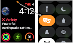
When I got my second smartwatch, which had built-in mobile service, one of the first things I did was try to answer a call. I read the instructions and tried three times, but it didn’t work. When I called the support line, I learned that I had somehow inadvertently activated a “Theater Mode” that turned off call notifications. A tiny blurry icon on my watch face was supposed to alert me that this mode was on, but I’d had no idea what it meant or whether it was important. And, I could barely see it.
 The ‘Theater’ mode icon on the watch face, at left, is too small to see with aging eyes. A larger icon, at right, would be better.
Screenshot by Edward Henry Steinfeld, CC BY-ND
As a bicycle commuter, I sometimes get phone calls about work while riding. To answer the call on my watch, I would need to release my right-hand grip on the handlebars, reach across and press the “answer call” icon, while looking at the watch to make sure I don’t press cancel by mistake. Then I’d need to regrip the handlebars with my right hand and hold my left wrist close to my head to talk and listen. It is not a good idea to do all this while trying to avoid potholes in an urban street.
I can route phone audio to my hearing aids. This avoids having to hold the phone close to my ear to hear, but it works only when it is relatively quiet around me. When there is lots of background noise, my hearing aids amplify the noise and drown out the phone’s audio signal.
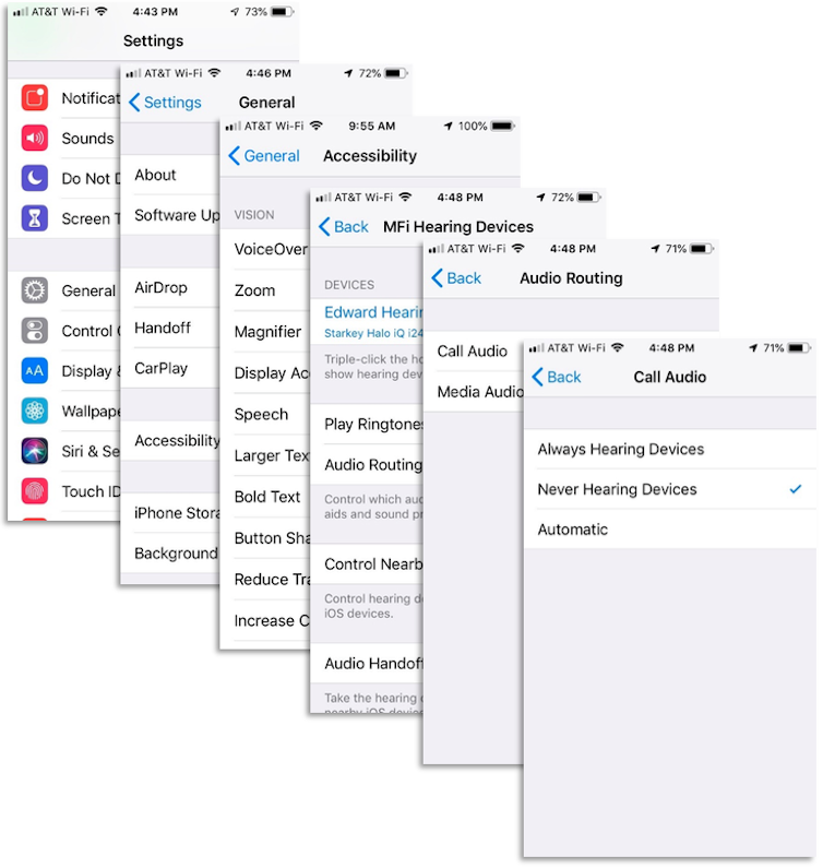
If I get a phone call while driving, there are four places I can direct the call: my car, my smartwatch, my hearing aids or the phone itself. But the phone seems to default to my hearing aids – even my millennial-aged hearing aid supplier cannot figure out why. That choice doesn’t activate the car microphone, though, so I still can’t talk without taking my hands off the steering wheel. I can turn off the hearing aid option, but it requires drilling down six levels on my phone.
 The setting controlling which device receives the audio is buried six levels deep in the phone interface.
Screenshots by Edward Henry Steinfeld, CC BY-ND
Handling complexity with design
In many ways, advanced technology is inherently complicated: If users want devices that can do incredible things, they need to deal with the complexity required to deliver those services. But the interfaces designers create often make it difficult to manage that complexity well, which confuses and frustrates users, and may even drive some to give up in despair of ever getting the darn things to work right.
Older users may be particularly prone to finding their gadgets exceeding their limits of agility, vision, hearing and cognitive capacity. All the mobile devices I use are reasonably usable by themselves and have accessibility features like interfaces with hearing aids and text magnification. But they’re not really designed to be easily used together.
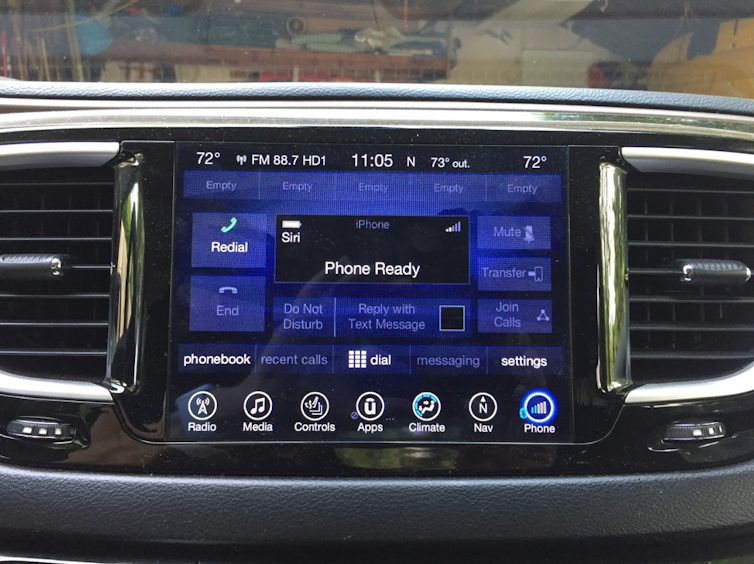
 My vehicle infotainment display shows only the status of the phone, not of other connected devices. Background images and reflections create perceptual clutter.
Edward Henry Steinfeld, CC BY-ND
It would be helpful if designers in the mobile technology industry thought broadly about how their devices might be used by a more diverse population, including those with mobility and sensory limits. My co-author and I explored this prospect, and its significance, in a book called “Universal Design, Creating Inclusive Environments.”
Overall, the mobile computing industry could adapt key principles of universal design, a philosophy that seeks to empower all users and enhance all users’ experiences. The best news is that our research shows that designs that work for older people will work that much better for everyone else.
Based on our knowledge, I’d recommend the mobile technology industry improve user experiences by ensuring every connected device with a screen has a personalized dashboard with direct access to all settings. Mobile devices should use a combination of easy-to-perceive icons, text and sound cues (which are coming to be called “earcons”) to give users clear information not just when they are standing still in the middle of the day, but also when they’re outdoors, at night, driving or bicycling.
They should also design accessories to be integrated with other equipment, such as microphones for talking on hearing-aid devices and touch-sensitive controls that could be mounted on walkers, canes and bicycles to avoid the need to release hand grips or divert attention from the path ahead. In addition, device makers should use their gadgets’ sensors to detect when the user is moving and automatically activate hands-free use, including canceling, answering and terminating telephone calls. With manufacturers’ help, more seniors could enjoy the benefits of advanced technology, without the frustrations.
Edward Henry Steinfeld, SUNY Distinguished Professor of Architecture, University at Buffalo, The State University of New York
Este artículo fue publicado originalmente en The Conversation. Lea el original. Photo: Pro Image Content/Shutterstock.com

